Client: SWRAC
Project Manager & Copywriting: Charlotte Flake
Photography: SWRAC
Project Manager & Copywriting: Charlotte Flake
Photography: SWRAC
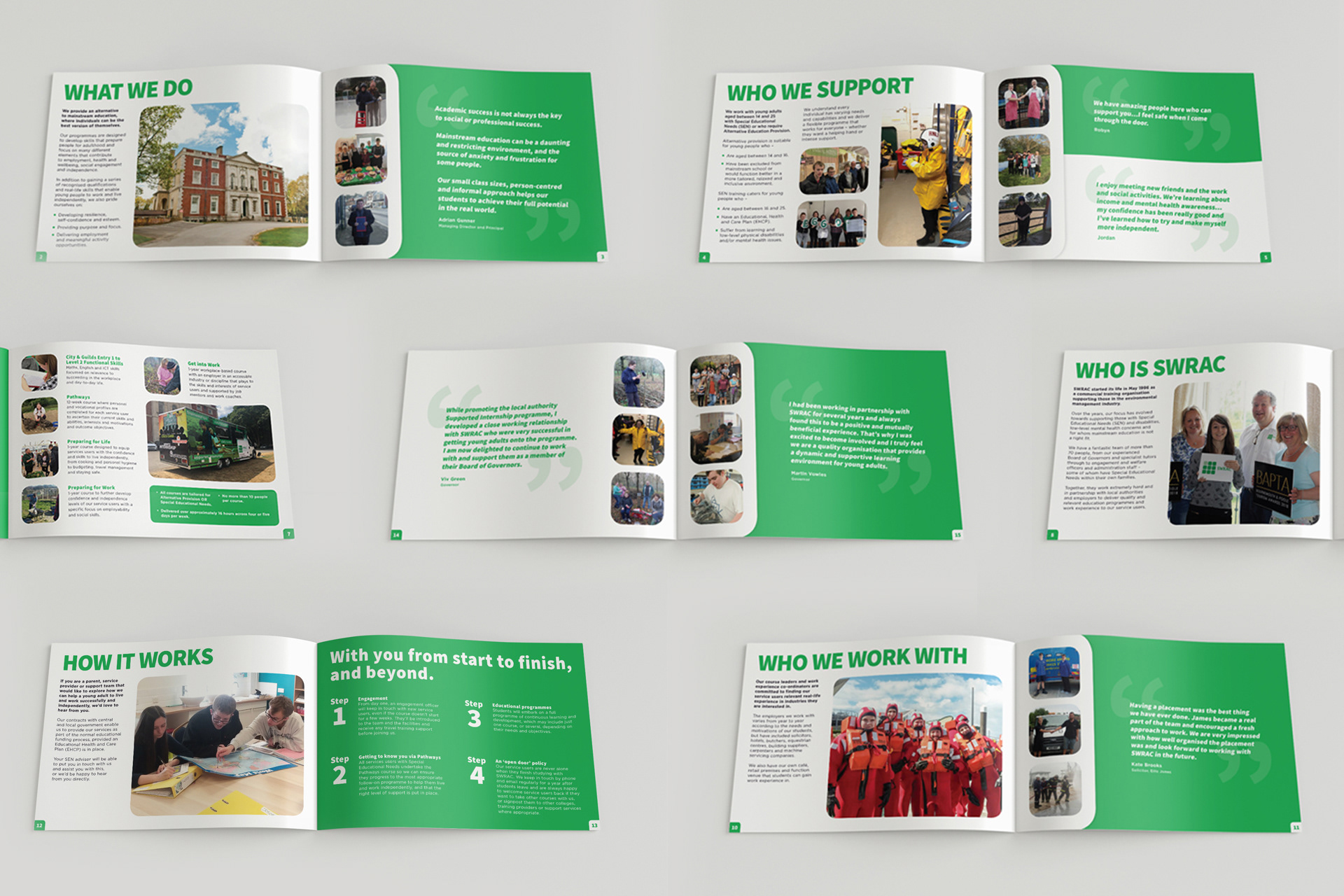
With no existing brand guidelines the brief was to relate the design to the logo, with its rounded squares and its vibrant green colour palette. Using these as squares as windows for the imagery and as a consistent containing device flowing from page to page.
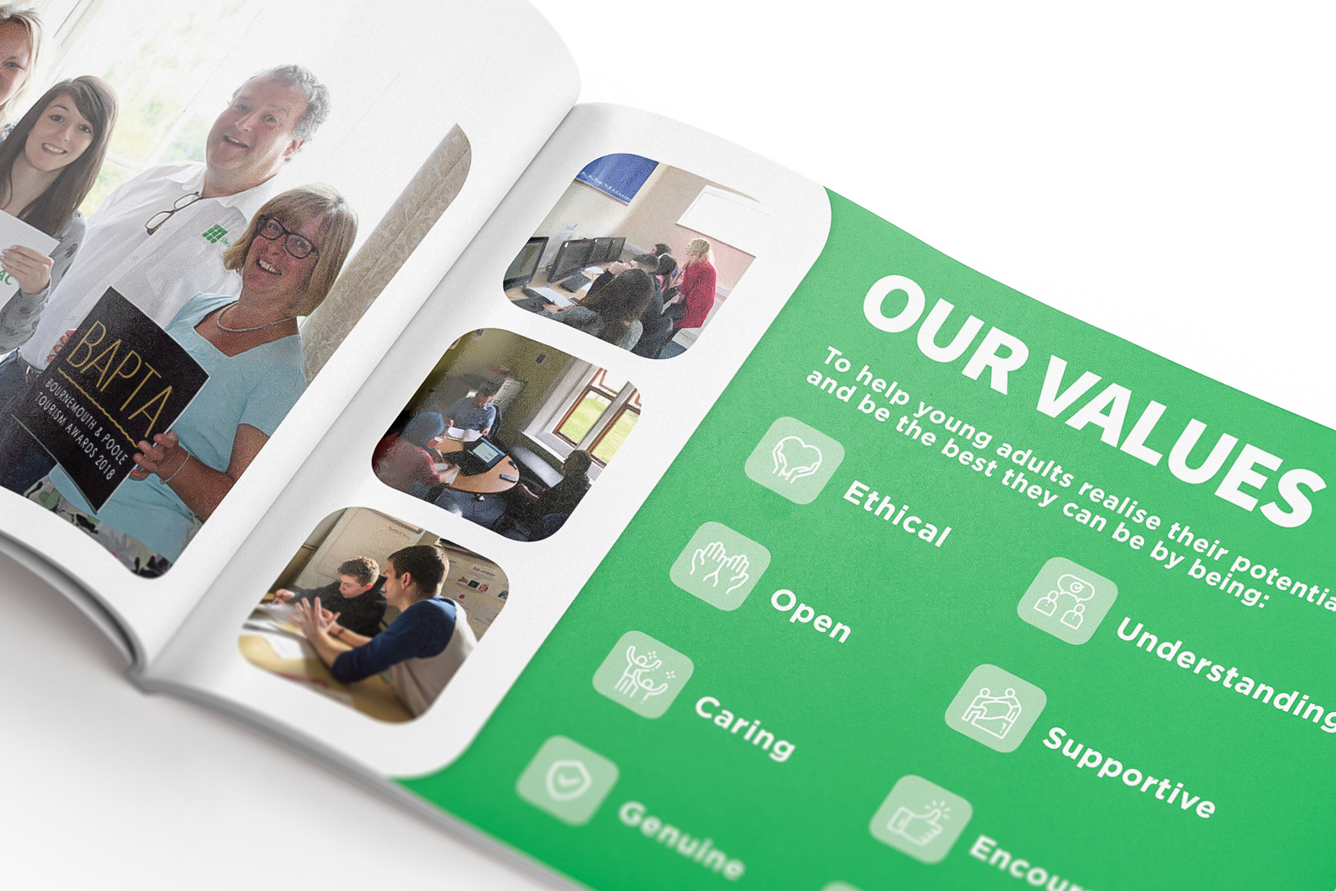
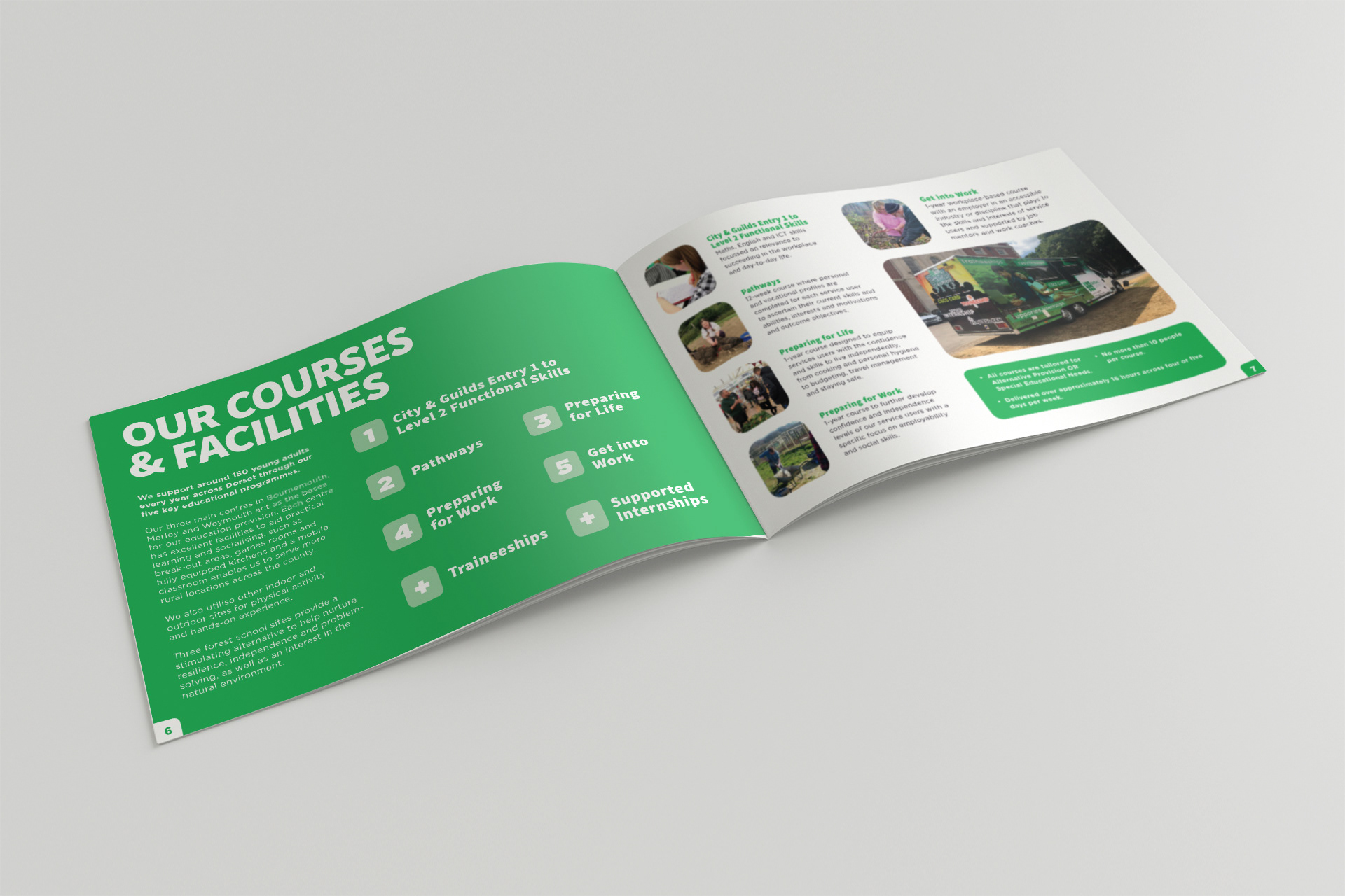
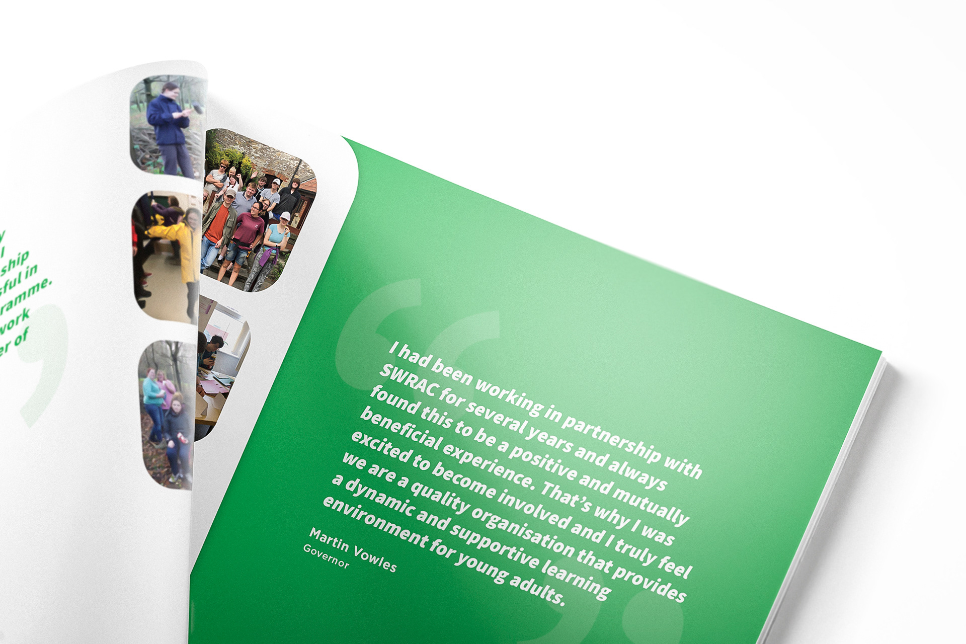
The bold titles, rounded corners and real life, personable imagery, help provide a friendly, informative and engaging brochure for both the students and the adults in charge of their care and education.